Hotels.com
Solo Project | 6 Weeks | 2022
Redesigning the app, Hotels.com for a university project brief. Analysing the user experience and identifying pain points to carry out a complete overhaul of the app's original design.
Research and User Insights
Carried out primary and secondary research to understand the current user experience.

Benchmarking
Comparing and contrasting two similar apps to gain insights into the user experience.

Site Mapping
Analysing the site map and user flow of both apps.
Customer Journey Maps
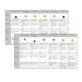
Creating customer journey maps to understand the user's experience and identify pain points.


Observations
Grouping observations to help identify themes and pinpoint user pain points.
Redesign Goals
-
User's must be able to browse all possible destinations from the home screen.
-
All important information must be displayed clearly and concisely, minimising clutter.
-
Enhance the filter and map features to create customer engagement.
-
Seamless start to finish booking process to prevent user drop off.
-
Consistent aesthetics and colours.
Ideation
Quick sketches of possible solutions.
_PNG.png)
Wireframe Mock-Ups

Prototyping Solutions


Original Design
-
Lack of context aware suggestions hinders user engagement.
-
Limited at a glance information reduces the efficiency of the user experience.
-
Inconsistent visual hierarchy and colour schemes.


Original Design
-
Small images reduce visual impact and hinder discoverability.
-
Interface has cluttered information, leading to cognitive overload and reduced usability.


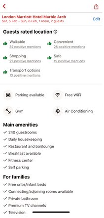
Original Design
-
Limited imagery at a glance reduces visual engagement.
-
A lot of information presented without clear prioritization, overwhelming the user.
-
Inconsistent use of icons for amenities can disrupt the user experience.
-
Difficult to locate further reviews can negatively impact the users trust.


Original Design
-
Absence of heading disrupts the visual hierarchy.
-
Poor organization of information negatively affects the user flow.


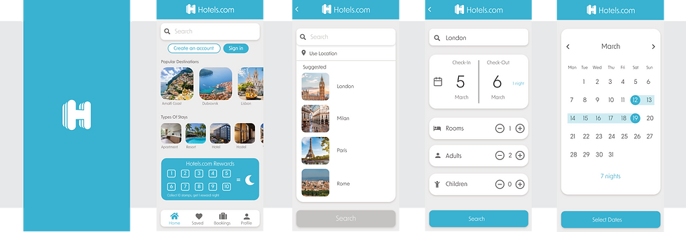
Redesign
-
Curated recommendations to drive initial user engagement.
-
A cohesive visual design is used to enhance the app's user interface.
-
Reimagined rewards presentation to boost user motivation and loyalty.

Redesign
-
Indicators inform users of the number of available options, aiding in decision making and navigation.
-
Additional images are accessible within the current page, improving content exploration.


Redesign
-
Increased availability of images boosts visual appeal.
-
Users are guided to explore additional information, enhancing navigation and user satisfaction.
-
Users can easily edit and access previously inputted information, creating a user-centric experience.
-
A combination of text and icons are user to create a user friendly experience and improve comprehension.


Redesign
-
Progress bar provides immediate feedback and reduces uncertainty.
-
The final booking overview is streamlines so that users can easily review and confirm their booking, creating an efficient experience.
Final Prototype